
Key Takeaways
- Pop-ups work best when they support a real visitor need instead of demanding attention.
- Relevance, timing, clear wording, and easy dismissal determine whether a prompt feels useful.
- Mobile-friendly and accessible design is essential, not an optional finishing touch.
- Measure negative signals alongside conversions to protect trust and usability.
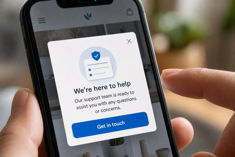
A well-designed website pop up can guide visitors toward a useful next step, such as saving an item, getting help, downloading a guide, or joining a newsletter. A poorly designed one can interrupt reading, block a purchase, and make a site feel less trustworthy within seconds. The difference is rarely just color, animation, or button style. Helpful pop-ups are based on context. They appear when the message is relevant, explain their value quickly, and give people a clear, pressure-free way to close them.
Why Some Pop-Ups Fail
Most frustrating pop-ups fail because they interrupt the visitor before the visitor has earned attention. A full-screen email offer that appears the moment someone lands on an article prevents them from evaluating the content. A discount prompt during checkout can distract a ready buyer. Repeating the same message after someone closes it signals that the site is prioritizing its own goals over the visitor’s choices. Vague offers also underperform. “Subscribe now” offers little reason to act, whereas “Get a monthly checklist for improving product pages” clearly explains the benefit. A pop-up should earn attention through relevance, not through size, surprise, or aggressive urgency.
Start With a Real User Need
Before choosing a layout, define the job the pop-up should help a visitor complete. It might answer a common question, offer a size guide on a product page, remind a returning shopper about a saved cart, or provide a useful resource after someone has read most of an article. If the prompt does not solve a clear problem, it does not need to exist.
Questions to Ask Before Building a Pop-Up
- What is the visitor trying to accomplish on this page?
- What might prevent them from completing that task?
- What specific value will this message provide?
- Can the same information appear in the page content or a smaller banner?
- Would the message still feel fair if the visitor declines it?
Choose the Right Trigger
There is no universal delay that makes a pop-up effective. Timing should reflect intent. A first-time reader may need time to scan an article, while a returning visitor on a pricing page may be ready to request a demo or compare plans.
- Time delay: Use it only after visitors have had enough time to understand the page.
- Scroll depth: Offer a related resource after readers show genuine interest in long-form content.
- Click action: Let people open a dialog after they request details, pricing, or a download.
- Exit behavior: Use sparingly to offer a meaningful alternative, not a desperate last-minute discount.
- Page intent: Match the message to the product, service, or topic currently being viewed.
Write Clear, Useful Copy
Pop-up copy should be short because visitors are making a fast decision. Lead with the benefit, add only the context needed to understand it, and use a button label that describes the result. “Send me the checklist” is more specific than “Submit,” and “View sizing guide” is clearer than “Learn more.”
A Simple Copy Structure
- State the benefit: Tell visitors what they receive.
- Explain the relevance: Make it clear why the prompt appears at this moment.
- Offer one primary action: Avoid competing buttons and choices.
- Make leaving easy: Use a visible close button and respectful decline text.
Avoid fake deadlines, guilt-based decline buttons, hidden terms, and requests for unnecessary personal data. Trust is easier to lose than rebuild, especially when a visitor is deciding whether to share contact information.
Design for Mobile First
A desktop dialog that looks polished can become unusable on a phone. On smaller screens, keep the message brief, use comfortable text size and spacing, and make every interactive control easy to tap. The close button should remain visible without requiring visitors to scroll or zoom.
Mobile Design Checks
- Keep the main message easy to scan in a few seconds.
- Use a layout that fits common phone widths without horizontal scrolling.
- Leave enough space between buttons, fields, and close controls.
- Test portrait and landscape orientation.
- Check the dialog with browser controls and virtual keyboards open.
- Make sure the page returns to a stable, usable position after closing.
Make the Experience Accessible
Accessible dialogs require more than adequate color contrast. When a modal opens, keyboard focus should move into it, remain within it while the modal is active, and return to the triggering control after it closes. The keyboard interaction guidance for modal dialogs also recommends a visible close control and Escape-key support. Give the dialog a clear title and an understandable description for screen-reader users. Do not label a dialog as modal unless people truly cannot interact with the content behind it. Test the experience with keyboard-only navigation, screen readers, and zoomed text before release.
Avoid Dark Patterns
Dark patterns are interface choices that pressure, confuse, or trap people into actions they did not freely choose. Tiny close icons, confusing opt-out language, multiple stacked pop-ups, and false countdown timers may create a short-term lift in clicks. Still, they can damage credibility and encourage visitors to leave. Search visitors are particularly sensitive to blocked content. Google advises sites to avoid intrusive dialogs that obscure a page and recommends smaller banners when a message is necessary, helping users reach the content they expected to see.
Test and Measure the Right Results
A high click-through rate is not proof that a pop-up is successful. Track outcomes after the prompt appears, including completion rate, close rate, page exits, return visits, unsubscribe requests, support complaints, and differences between mobile and desktop visitors. A message that produces more leads but sharply increases exits may not be a win.
Simple A/B Tests to Run
- Compare a time delay with a scroll-based trigger.
- Test a concise benefit-led heading against a longer explanatory heading.
- Compare one form field with a multi-field form.
- Test a compact banner against a centered modal.
- Compare a specific button label with a generic call to action.
Use a Practical Launch Checklist
- The message supports a clear visitor goal.
- The trigger matches the likely intent on the current page.
- The benefit is explained in plain language.
- The close button is prominent and easy to use.
- The design works on small screens and with virtual keyboards.
- Keyboard focus and screen-reader behavior have been tested.
- Frequency limits prevent repeated interruptions.
- Offers, deadlines, and subscription terms are honest.
- Success reporting includes user-experience signals, not only conversions.
Final Thoughts
The most effective pop-ups are not built around interruption. They are built around timing, context, clarity, and respect. When a prompt helps visitors complete a task or discover something genuinely useful, it feels like a natural part of the experience. Give people a good reason to engage, make the choice simple, and make declining just as easy. Well-designed pop-ups should support the visitor’s goals rather than compete with them. Clear messaging, thoughtful placement, and relevant offers can improve engagement without creating frustration. Testing different triggers, designs, and copy can also reveal what works best for different audiences. When used with restraint and a clear purpose, pop-ups can encourage meaningful actions while preserving a smooth, trustworthy, and user-friendly browsing experience.


